Visualize alpha diversity with scatterplots and trendlines.
Usage
adiv_corrplot(
  biom,
  x,
  adiv = "Shannon",
  layers = "tc",
  stat.by = NULL,
  facet.by = NULL,
  colors = TRUE,
  shapes = TRUE,
  test = "emmeans",
  fit = "gam",
  at = NULL,
  level = 0.95,
  p.adj = "fdr",
  transform = "none",
  alt = "!=",
  mu = 0,
  caption = TRUE,
  check = FALSE,
  ...
)
Arguments
- biom
An rbiom object, or any value accepted by
as_rbiom().- x
Dataset field with the x-axis values. Equivalent to the
regrargument instats_table(). Required.- adiv
Alpha diversity metric(s) to use. Options are:
c("ace", "berger", "brillouin", "chao1", "faith", "fisher", "simpson", "inv_simpson", "margalef", "mcintosh", "menhinick", "observed", "shannon", "squares"). For"faith", a phylogenetic tree must be present inbiomor explicitly provided viatree=. Setadiv=".all"to use all metrics. Multiple/abbreviated values allowed. Default:"shannon"- layers
One or more of
c("trend", "confidence", "point", "name", "residual"). Single letter abbreviations are also accepted. For instance,c("trend", "point")is equivalent toc("t", "p")and"tp". Default:"tc"- stat.by
Dataset field with the statistical groups. Must be categorical. Default:
NULL- facet.by
Dataset field(s) to use for faceting. Must be categorical. Default:
NULL- colors
How to color the groups. Options are:
TRUE-Automatically select colorblind-friendly colors.
FALSEorNULL-Don't use colors.
- a palette name -
Auto-select colors from this set. E.g.
"okabe"- character vector -
Custom colors to use. E.g.
c("red", "#00FF00")- named character vector -
Explicit mapping. E.g.
c(Male = "blue", Female = "red")
See "Aesthetics" section below for additional information. Default:
TRUE- shapes
Shapes for each group. Options are similar to
colors's:TRUE,FALSE,NULL, shape names (typically integers 0 - 17), or a named vector mapping groups to specific shape names. See "Aesthetics" section below for additional information. Default:TRUE- test
Method for computing p-values:
'none','emmeans', or'emtrends'. Default:'emmeans'- fit
How to fit the trendline.
'lm','log', or'gam'. Default:'gam'- at
Position(s) along the x-axis where the means or slopes should be evaluated. Default:
NULL, which samples 100 evenly spaced positions and selects the position where the p-value is most significant.- level
The confidence level for calculating a confidence interval. Default:
0.95- p.adj
Method to use for multiple comparisons adjustment of p-values. Run
p.adjust.methodsfor a list of available options. Default:"fdr"- transform
Transformation to apply to calculated values. Options are:
c("none", "rank", "log", "log1p", "sqrt", "percent")."rank"is useful for correcting for non-normally distributions before applying regression statistics. Default:"none"- alt
Alternative hypothesis direction. Options are
'!='(two-sided; not equal tomu),'<'(less thanmu), or'>'(greater thanmu). Default:'!='- mu
Reference value to test against. Default:
0- caption
Add methodology caption beneath the plot. Default:
TRUE- check
Generate additional plots to aid in assessing data normality. Default:
FALSE- ...
Additional parameters to pass along to ggplot2 functions. Prefix a parameter name with a layer name to pass it to only that layer. For instance,
p.size = 2ensures only the points have their size set to2.
Value
A ggplot2 plot. The computed data points, ggplot2 command,
stats table, and stats table commands are available as $data,
$code, $stats, and $stats$code, respectively.
Aesthetics
All built-in color palettes are colorblind-friendly. The available
categorical palette names are: "okabe", "carto", "r4",
"polychrome", "tol", "bright", "light",
"muted", "vibrant", "tableau", "classic",
"alphabet", "tableau20", "kelly", and "fishy".
Shapes can be given as per base R - numbers 0 through 17 for various shapes, or the decimal value of an ascii character, e.g. a-z = 65:90; A-Z = 97:122 to use letters instead of shapes on the plot. Character strings may used as well.
See also
Other alpha_diversity:
adiv_boxplot(),
adiv_stats(),
adiv_table()
Other visualization:
adiv_boxplot(),
bdiv_boxplot(),
bdiv_corrplot(),
bdiv_heatmap(),
bdiv_ord_plot(),
plot_heatmap(),
rare_corrplot(),
rare_multiplot(),
rare_stacked(),
stats_boxplot(),
stats_corrplot(),
taxa_boxplot(),
taxa_corrplot(),
taxa_heatmap(),
taxa_stacked()
Examples
library(rbiom)
p <- adiv_corrplot(babies, "age", stat.by = "deliv", fit = "gam")
p
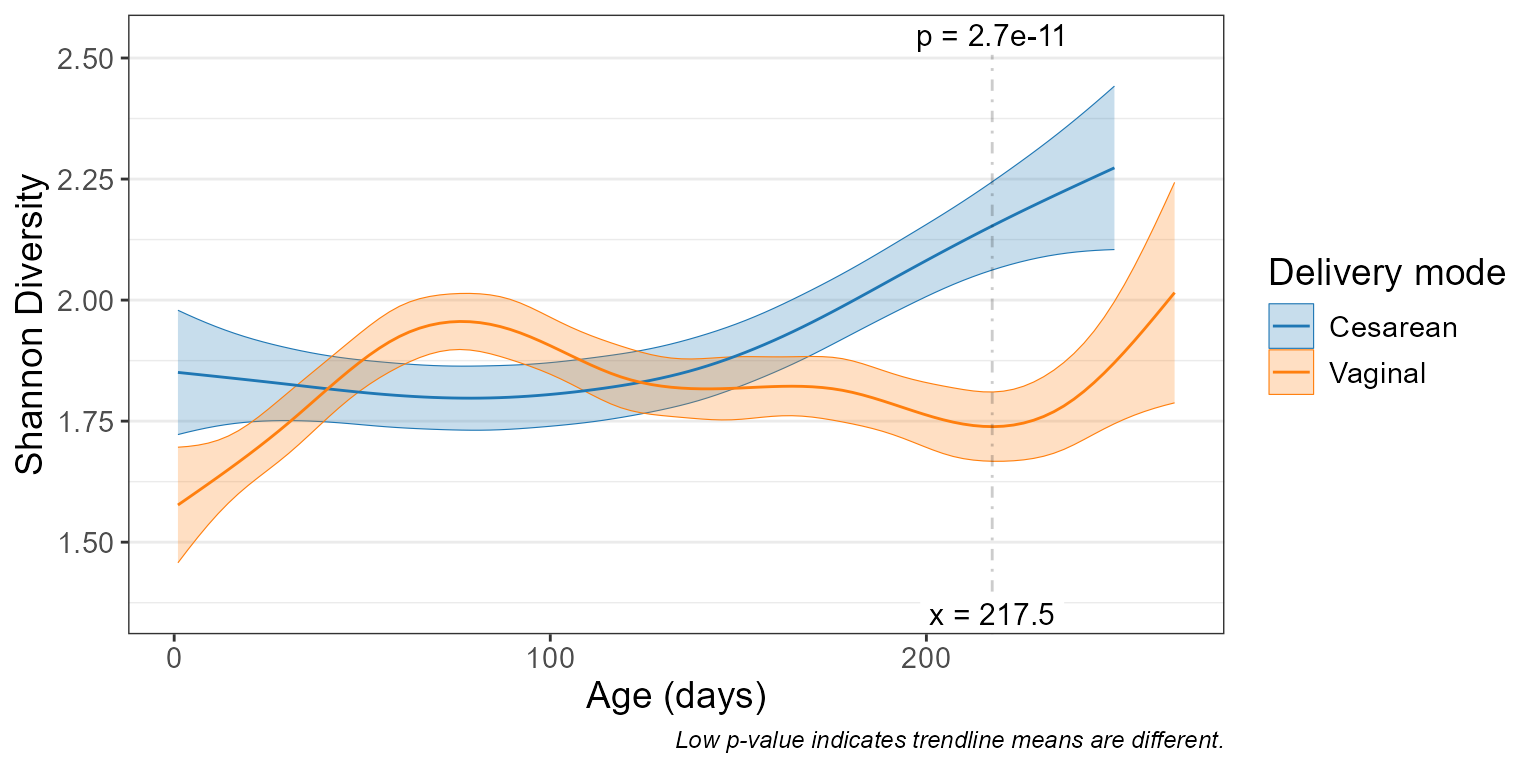 p$stats
#> # Model: gam(c(.diversity ~ s(`Age (days)`, by = `Delivery mode`, bs = "cs")
#> # + , `Delivery mode`), method = "REML")
#> # A tibble: 1 × 15
#> `Age (days)` `Delivery mode` .mean.diff .h1 .p.val .adj.p .effect.size
#> <dbl> <fct> <dbl> <fct> <dbl> <dbl> <dbl>
#> 1 218. Cesarean - Vagin… 0.414 != 0 2.68e-11 2.68e-11 0.694
#> # ℹ 8 more variables: .se <dbl>, .n <int>, .df <int>, .t.ratio <dbl>,
#> # .adj.r <dbl>, .aic <dbl>, .bic <dbl>, .loglik <dbl>
p$code
#> ggplot(data, aes(x = `Age (days)`, y = .diversity)) +
#> geom_ribbon(
#> mapping = aes(ymin = .ymin, ymax = .ymax, color = `Delivery mode`, fill = `Delivery mode`),
#> data = ~attr(., "fit"),
#> alpha = 0.25,
#> linewidth = 0.2 ) +
#> geom_line(
#> mapping = aes(color = `Delivery mode`),
#> data = ~attr(., "fit") ) +
#> geom_vline(
#> mapping = aes(xintercept = `Age (days)`),
#> data = ~attr(., "stat_vline"),
#> alpha = 0.2,
#> linetype = "dotdash" ) +
#> geom_label(
#> mapping = aes(label = .label, hjust = .hjust, vjust = .vjust),
#> data = ~attr(., "stat_labels"),
#> linewidth = NA,
#> size = 4 ) +
#> labs(
#> caption = "Low p-value indicates trendline means are different.",
#> y = "Shannon Diversity Index" ) +
#> scale_color_manual(values = c("#1F77B4", "#FF7F0E")) +
#> scale_fill_manual(values = c("#1F77B4", "#FF7F0E")) +
#> scale_x_continuous() +
#> scale_y_continuous(expand = c(0.15, 0, 0.15, 0)) +
#> theme_bw() +
#> theme(
#> text = element_text(size = 14),
#> panel.grid.major.x = element_blank(),
#> panel.grid.minor.x = element_blank(),
#> plot.caption = element_text(face = "italic", size = 9) )
p$stats
#> # Model: gam(c(.diversity ~ s(`Age (days)`, by = `Delivery mode`, bs = "cs")
#> # + , `Delivery mode`), method = "REML")
#> # A tibble: 1 × 15
#> `Age (days)` `Delivery mode` .mean.diff .h1 .p.val .adj.p .effect.size
#> <dbl> <fct> <dbl> <fct> <dbl> <dbl> <dbl>
#> 1 218. Cesarean - Vagin… 0.414 != 0 2.68e-11 2.68e-11 0.694
#> # ℹ 8 more variables: .se <dbl>, .n <int>, .df <int>, .t.ratio <dbl>,
#> # .adj.r <dbl>, .aic <dbl>, .bic <dbl>, .loglik <dbl>
p$code
#> ggplot(data, aes(x = `Age (days)`, y = .diversity)) +
#> geom_ribbon(
#> mapping = aes(ymin = .ymin, ymax = .ymax, color = `Delivery mode`, fill = `Delivery mode`),
#> data = ~attr(., "fit"),
#> alpha = 0.25,
#> linewidth = 0.2 ) +
#> geom_line(
#> mapping = aes(color = `Delivery mode`),
#> data = ~attr(., "fit") ) +
#> geom_vline(
#> mapping = aes(xintercept = `Age (days)`),
#> data = ~attr(., "stat_vline"),
#> alpha = 0.2,
#> linetype = "dotdash" ) +
#> geom_label(
#> mapping = aes(label = .label, hjust = .hjust, vjust = .vjust),
#> data = ~attr(., "stat_labels"),
#> linewidth = NA,
#> size = 4 ) +
#> labs(
#> caption = "Low p-value indicates trendline means are different.",
#> y = "Shannon Diversity Index" ) +
#> scale_color_manual(values = c("#1F77B4", "#FF7F0E")) +
#> scale_fill_manual(values = c("#1F77B4", "#FF7F0E")) +
#> scale_x_continuous() +
#> scale_y_continuous(expand = c(0.15, 0, 0.15, 0)) +
#> theme_bw() +
#> theme(
#> text = element_text(size = 14),
#> panel.grid.major.x = element_blank(),
#> panel.grid.minor.x = element_blank(),
#> plot.caption = element_text(face = "italic", size = 9) )